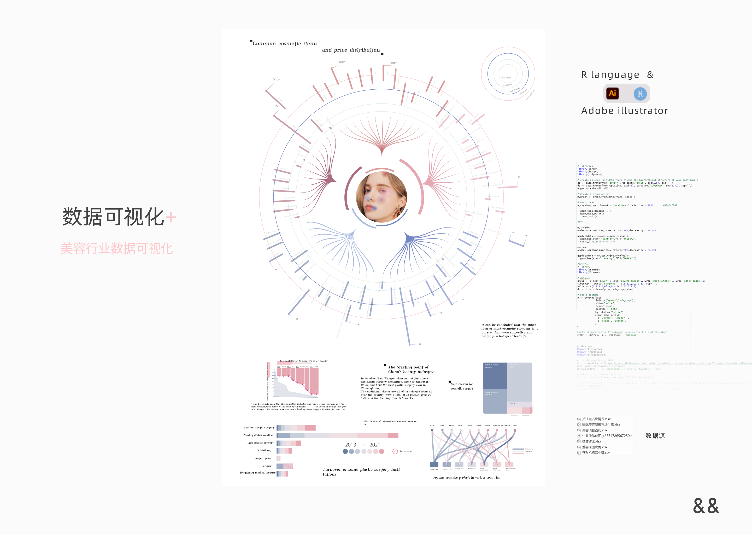
Corresponding environment source code
                    # libraries
                    library(ggraph)
                    library(igraph)
                    library(tidyverse)

                    # create an edge list data frame giving the hierarchical structure of your individuals
                    d1 <- data.frame(from="origin", to=paste("group", seq(1,5), sep=""))
                    d2 <- data.frame(from=rep(d1$to, each=5), to=paste("subgroup", seq(1,30), sep=""))
                    edges <- rbind(d1, d2)

                    # Create a graph object
                    mygraph <- graph_from_data_frame( edges )

                    # Basic tree
                    ggraph(mygraph, layout = 'dendrogram', circular = TRUE       ##�Ƿ�Բ��##
                    ) +
                      geom_edge_diagonal() +
                      geom_node_point() +
                      theme_void()

                    ##��״ͼ

                    my<-fenbu
                    order<-sort(my$sum,index.return=TRUE,decreasing = FALSE)

                    ggplot(data = my,aes(x=job,y=value))+
                      geom_bar(stat="identity",fill="#69B3A2")+
                      coord_flip()#####ˮƽ��תͼ��+

                    my<-cont
                    order<-sort(my$sum,index.return=TRUE,decreasing = FALSE)

                    ggplot(data = my,aes(x=job,y=value))+
                      geom_bar(stat="identity",fill="#69B3A2")

                    ###���ͼ
                    # library
                    library(treemap)
                    library(d3treeR)

                    # dataset
                    group <- c(rep("cover",2),rep("psychological",2),rep("best outlook",2),rep("other cause",1))
                    subgroup <- paste("subgroup" , c(1,2,1,2,1,2,1), sep="-")
                    value <- c(6.2,3.5,67.9,9.4,44.1,42.5,1.2)
                    data <- data.frame(group,subgroup,value)

                    # basic treemap
                    p <- treemap(data,
                                 index=c("group","subgroup"),
                                 vSize="value",
                                 type="index",
                                 palette = "Set2",
                                 bg.labels=c("white"),
                                 align.labels=list(
                                   c("center", "center"),
                                   c("right", "bottom")
                                 )
                    )

                    # make it interactive ("rootname" becomes the title of the plot):
                    inter <- d3tree2( p ,  rootname = "General" )

                    # save the widget
                    # library(htmlwidgets)
                    # saveWidget(inter, file=paste0( getwd(), "/HtmlWidget/interactiveTreemap.html"))


                    group <- c(rep("attitude",4))
                    subgroup <- paste("subgroup" , c(1,2,3,4), sep="-")
                    value <- c(5.6,21.6,40.5,32.3)
                    data <- data.frame(group,subgroup,value)

                    # basic treemap
                    p <- treemap(data,
                                 index=c("group","subgroup"),
                                 vSize="value",
                                 type="index",
                                 palette = "Set2",
                                 bg.labels=c("white"),
                                 align.labels=list(
                                   c("center", "center"),
                                   c("right", "bottom")
                                 )
                    )

                    # make it interactive ("rootname" becomes the title of the plot):
                    inter <- d3tree2( p ,  rootname = "General" )

                    ##ԲԲͼ

                    # Libraries
                    library(tidyverse)
                    library(hrbrthemes)
                    library(circlepackeR)

                    # Load dataset from github
                    data <- read.table("https://raw.githubusercontent.com/holtzy/data_to_viz/master/Example_dataset/11_SevCatOneNumNestedOneObsPerGroup.csv", header=T, sep=";")
                    data[ which(data$value==-1),"value"] <- 1
                    colnames(data) <- c("Continent", "Region", "Country", "Pop")

                    # Remove a few problematic lines
                    data <- data %>% filter(Continent!="") %>% droplevels()

                    # Change the format. This use the data.tree library. This library needs a column that looks like root/group/subgroup/..., so I build it
                    library(data.tree)
                    data$pathString <- paste("world", data$Continent, data$Region, data$Country, sep = "/")
                    population <- as.Node(data)

                    # You can custom the minimum and maximum value of the color range.
                    circlepackeR(population, size = "Pop", color_min = "hsl(56,80%,80%)", color_max = "hsl(341,30%,40%)")##r�汾��ƥ��

                    ##�ѵ�ͼ
                    library(ggplot2)
                    library(RColorBrewer)
                    library(reshape2)


                    mydata<-���λ���Ӫҵ��


                    ggplot(data=mydata,aes(x=���λ���,y=Ӫҵ��.����.))+
                      geom_bar(stat="identity",position="stack",color="black",
                               width=0.7,size=0.25)+
                      scale_fill_manual(values=brewer.pal(9,"YlOrRd")[c(3:7)])+
                      ylim(0,12000)